Worried a neutral color palette for home will feel flat? Choose one warm base shade, layer in texture, and keep a small, deeper contrast for depth. That mix keeps a neutral room calm without making it dull.
This guide sits inside the wider home decor ideas collection, which covers more rooms and styles.
| Item | Value |
|---|---|
| Dominant color share | 60% of the room |
| Secondary color share | 30% of the room |
| Accent color share | 10% of the room |
| Neutrals in a three-color scheme | At least 1 of 3 colors |
| Color schemes worth knowing for the rule | 4 (complementary, monochromatic, analogous, triadic) |
The figures come from Asian Paints’ guide to the 60-30-10 rule and House Digest’s color rule guide. Design guidance changes and varies between designers, so check the sources before you rely on them.
What makes a neutral palette work?
A neutral palette is not limited to white or beige. House Digest notes that neutrals can come in blacks, metallics and wood tones, so you have more range than you might expect.
In a piece published 23 February 2025, Homes & Gardens described a neutral color scheme as among the most timeless, creating a calming space that suits many styles, from traditional to modern. The risk is that a room built only from quiet shades can feel flat.
Hannah Yeo of Benjamin Moore points to the undertones neutrals carry. As quoted by Homes & Gardens, she says their true beauty lies in the rich array of undertones they offer.
Before you buy any paint, settle these points:
- Your base shade and the undertone you want it to carry.
- Which materials and fabrics will add texture.
- Where a small, deeper contrast will sit.
Start with warm neutral paint
Ruth Mottershead, Creative Director at Little Greene, says stone shades are not a return to beige or greige. In her words, quoted by Homes & Gardens, they are a way of using warmer, natural shades to create schemes with longevity.
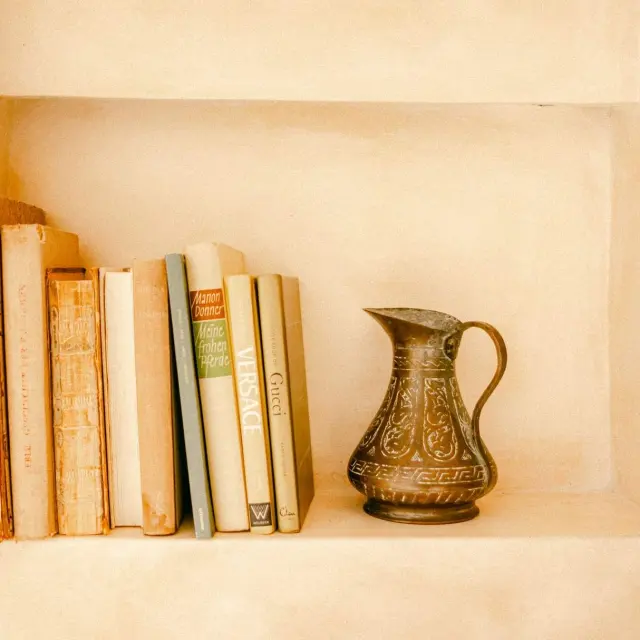
Her suggestion is Travertine on walls, paired with the lighter Stock on ceilings, or taken part of the way up the wall to open up the space and give the illusion of height. She adds that the warmth of natural stone hues works well with bare wood finishes, touches of rattan and unglazed ceramics, according to the same Homes & Gardens feature.
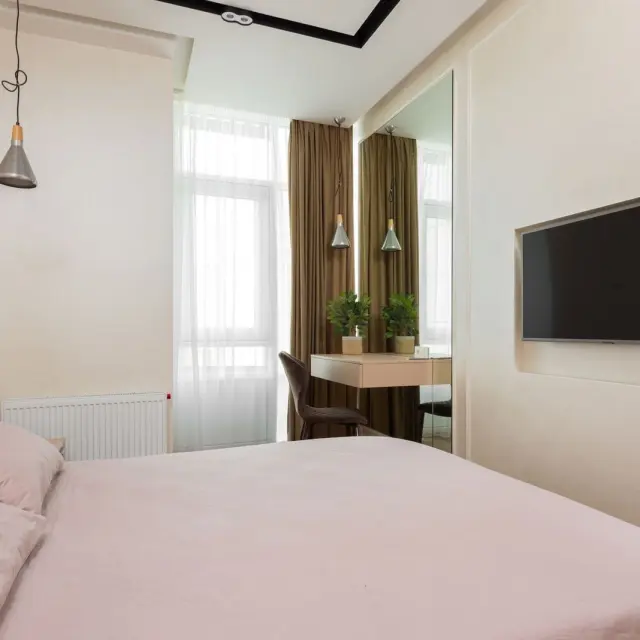
Asian Paints lists beige, white, grey and cream as neutral shades that work as the dominant color. It also suggests pairing beige with brown, olive green or navy blue if you want a supporting shade.
Use the 60-30-10 rule with neutrals
The 60-30-10 rule is a simple design formula for balancing a room with three colors. Asian Paints describes it as 60% dominant color, 30% secondary color and 10% accent color.
The rule works for quiet rooms too. SheerLuxe says a neutral room can follow the 60-30-10 principle just as effectively as a colorful one, with contrast coming from depth, texture or finish rather than a bright accent.
A practical order for a neutral room:
- Set the dominant layer with walls, flooring and larger pieces of furniture.
- Add the secondary layer through joinery, curtains, rugs or upholstery.
- Finish with accents such as artwork, lighting, cushions and decorative pieces.
The same SheerLuxe feature adds that the value lies less in sticking rigidly to the numbers and more in using them as a starting point. Treat the split as a guide, not a maths problem.
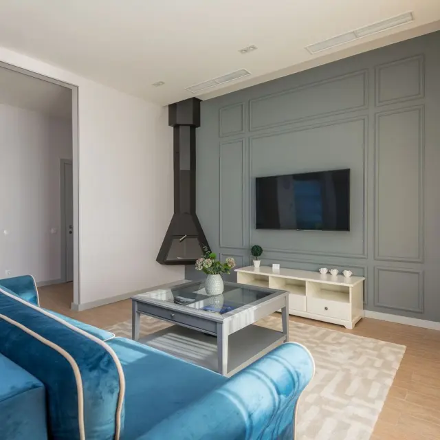
If you are planning a neutral seating area, these living room decor ideas give you more to work with. A smaller space is also a good place to test a calm scheme, and the entryway decor ideas are a useful next read.
Check how many colors you are really using, too. House Digest advises making sure at least one of your three colors is neutral, and says walls are the likely place to show your main color because they take up the majority of the visual space.
Add texture and shape so neutrals stay interesting
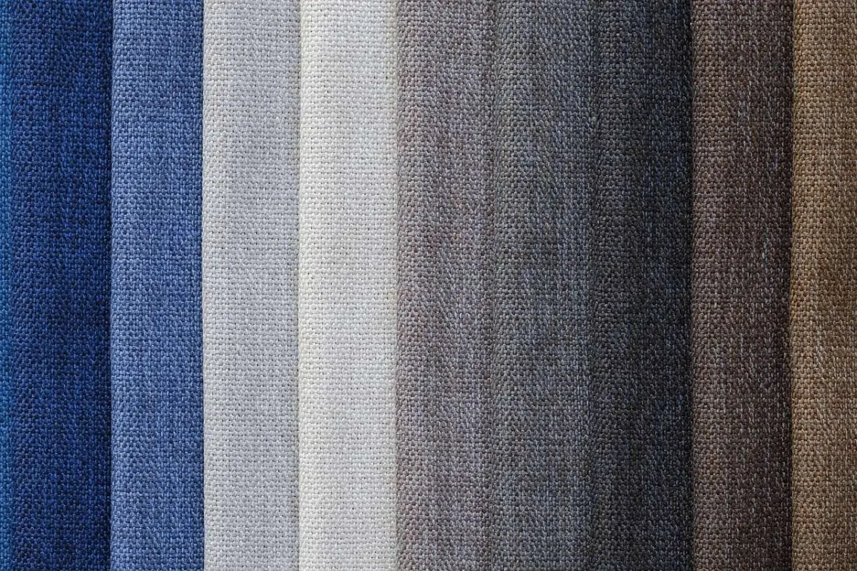
Texture does the work that color would do elsewhere. Christine Carney of Blackberry Farm Design says layering multiple textures and various materials is the easiest way to make a neutral room feel more interesting and alive, as quoted by Homes & Gardens.

Interior designer Jenny Luck suggests combining woods and ceramics for the harder surfaces, then softening with a variety of soft furnishings and textiles. Carney also points to the texture of wood grain, the sparkle of a glass sculpture and the shimmer of a metal accessory.
Ways to add layers without adding color:
- Mix woods and ceramics with soft furnishings and textiles.
- Bring in a glass or metal accessory for a little shine.
- Choose rounded shapes, such as a curved sofa, to create visual interest.
The curved-sofa idea comes from Tash Bradley of Lick, who encourages playing around with shapes. It is a useful reminder that form can be as lively as color.
Keep the final layer personal
The last layer is where a neutral room becomes yours. SheerLuxe quotes designer Sarah Brown saying the accent could simply be a deeper shade of brown, an antique bronze finish, dark timber, even white or a textured fabric.
It is also the easiest layer to change. Dominic Myland of Mylands says updating the final 10% is often the most affordable way to refresh a room, per SheerLuxe.
Sarah Brown lists a few new cushions, a lampshade, fresh flowers, ceramics or a piece of artwork as updates that can change the atmosphere. Myland adds that a beautifully painted room gains depth through the interplay of timber, stone, natural fabrics, metals and texture.
Frequently asked questions
Does a neutral palette have to be beige?
Show answer
No. House Digest says neutrals can come in blacks, metallics, wood tones and so on, and Little Greene’s Ruth Mottershead describes warm stone shades as an alternative to beige or greige, per Homes & Gardens.
How many neutrals should a scheme include?
Show answer
For a three-color scheme, House Digest says to ensure at least one color is neutral. A fully neutral room is also fine if you add contrast through texture, material and finish.
Do I have to follow the percentages exactly?
Show answer
No. SheerLuxe reports that designers treat the numbers as a starting point rather than a strict formula.
How do I stop a neutral room feeling flat?
Show answer
Layer textures and materials, as Christine Carney advises in Homes & Gardens. Mixing wood grain, glass, metal and soft fabrics gives the eye plenty to take in even when the colors stay quiet.