Not sure where to begin? Your best home decor ideas start with a few simple design principles, applied room by room so every choice you make feels deliberate.
| Key fact | Value |
|---|---|
| Core design principles (Homes & Gardens, December 2025) | 5 principles |
| Types of balance | 3 types |
| Color split (60-30-10 rule) | 60% dominant, 30% secondary, 10% accent |
| Odd-number groupings for styling | 3, 5, or 7 items |
| Focal points per room | 1 strong focal point |
| Layers in a lighting scheme | 3 layers (ambient, task, accent) |
These figures come from Homes & Gardens and DesignFiles. Design guidance can change, so check the sources before you rely on the numbers.
Why principles come before shopping
A room that works usually starts with a plan rather than a purchase. Once you know the handful of ideas designers lean on, choosing a sofa, a rug or a paint color gets much less stressful.
Different writers count the principles differently, but they overlap heavily. Here is how three published guides frame them:
- Homes & Gardens, published 17 December 2025, walks through the five key principles: balance, rhythm, emphasis, proportion and scale, and harmony.
- DesignFiles, in a September 4, 2025 post, breaks down ten principles and adds contrast, functionality, details, variety and movement.
- Yanko Design, in a 2024 piece, lists seven: balance, harmony, rhythm, proportion and scale, emphasis, contrast, and detail.
Treat all of them as guidelines, not commandments. Designer Sean Symington told Homes & Gardens that rules in design are there to be bent, and if you’d like, broken altogether.
How do you get balance, rhythm and emphasis right?
These three principles do most of the work in any room. Start with balance: Homes & Gardens describes three types.
- Symmetrical: each side of the room carries equal weight, such as matching sofas facing each other with sconces flanking a mirror above the fireplace.
- Asymmetrical: different elements share the same overall visual weight, such as one bold artwork on one side of an alcove and shelves of smaller objects on the other.
- Radial: everything is arranged around a round focal point, like a circular dining table with chairs around it.
If a symmetrical room feels flat, shake it up with a lamp in a different color or a cushion with a different pattern, as suggested by Homes & Gardens. DesignFiles also suggests thinking vertically as well as horizontally, for example by weighing tall shelves against low cabinets.
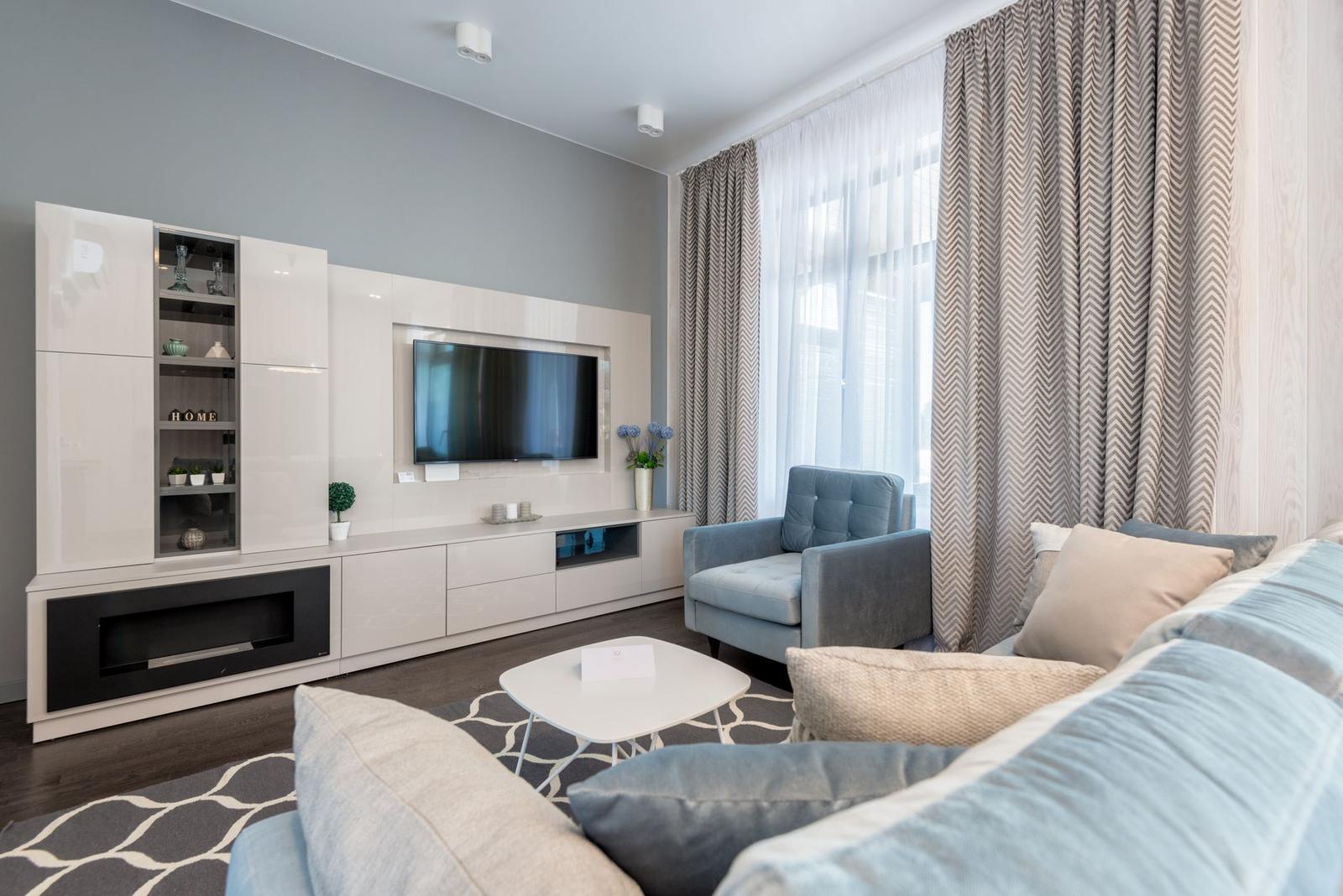
Next comes rhythm, the visual beat of a room. Homes & Gardens says you can bring it in by repeating colors, patterns and shapes and spacing them out evenly. Yanko Design gives the example of repeating a geometric pattern across rugs, throw pillows and artwork.
Then give the room a focal point. DesignFiles advises choosing one strong focal point per room to avoid visual clutter. Its principles post warns that without emphasis a space can feel directionless or scattered, especially if too many elements compete for attention.
Art makes an easy focal point, and these gallery wall ideas show how to group frames so they read as a single feature. Shelving can anchor a wall too, and a guide on how to style a bookshelf helps you keep it balanced rather than crowded.
Color, contrast and a consistent style
The simplest color plan is the 60-30-10 rule, which DesignFiles calls one of the most timeless principles in interior design. It works across styles and extends beyond walls to furniture, textiles and decor.
- 60% dominant color: walls, large furniture pieces and area rugs.
- 30% secondary color: drapery or accent chairs that support the main hue and add contrast.
- 10% accent color: throw pillows, vases and artwork.
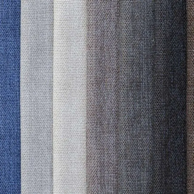
A calm base is easy to build from a neutral color palette for home. DesignFiles recommends pairing a neutral base with bold contrasting accents, and combining materials such as wood and metal for tactile contrast.
Style needs the same discipline. DesignFiles describes stylistic harmony as consistency in design styles, such as mid-century modern or rustic, applied to furniture, lighting and accessories. Pick a direction and repeat it, rather than buying one of everything.
If you want a ready-made direction, farmhouse decor ideas lean warm and rustic, while boho decor ideas favor layered, collected looks. Either one gives your color and texture choices something to stay consistent with.
Room-by-room: where to apply the ideas
Every room has its own job, so the same principles show up in different ways. Use the notes below as a starting point and adjust to your own layout.
Living room
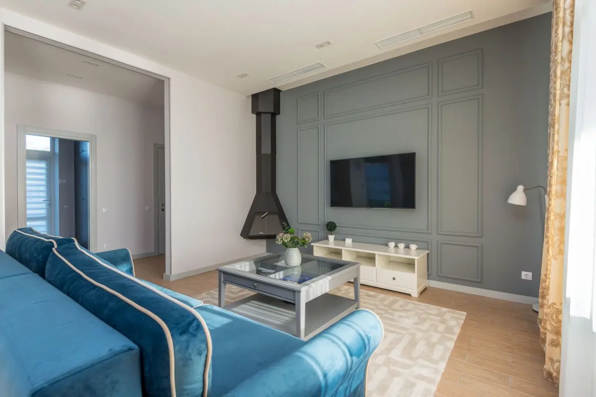
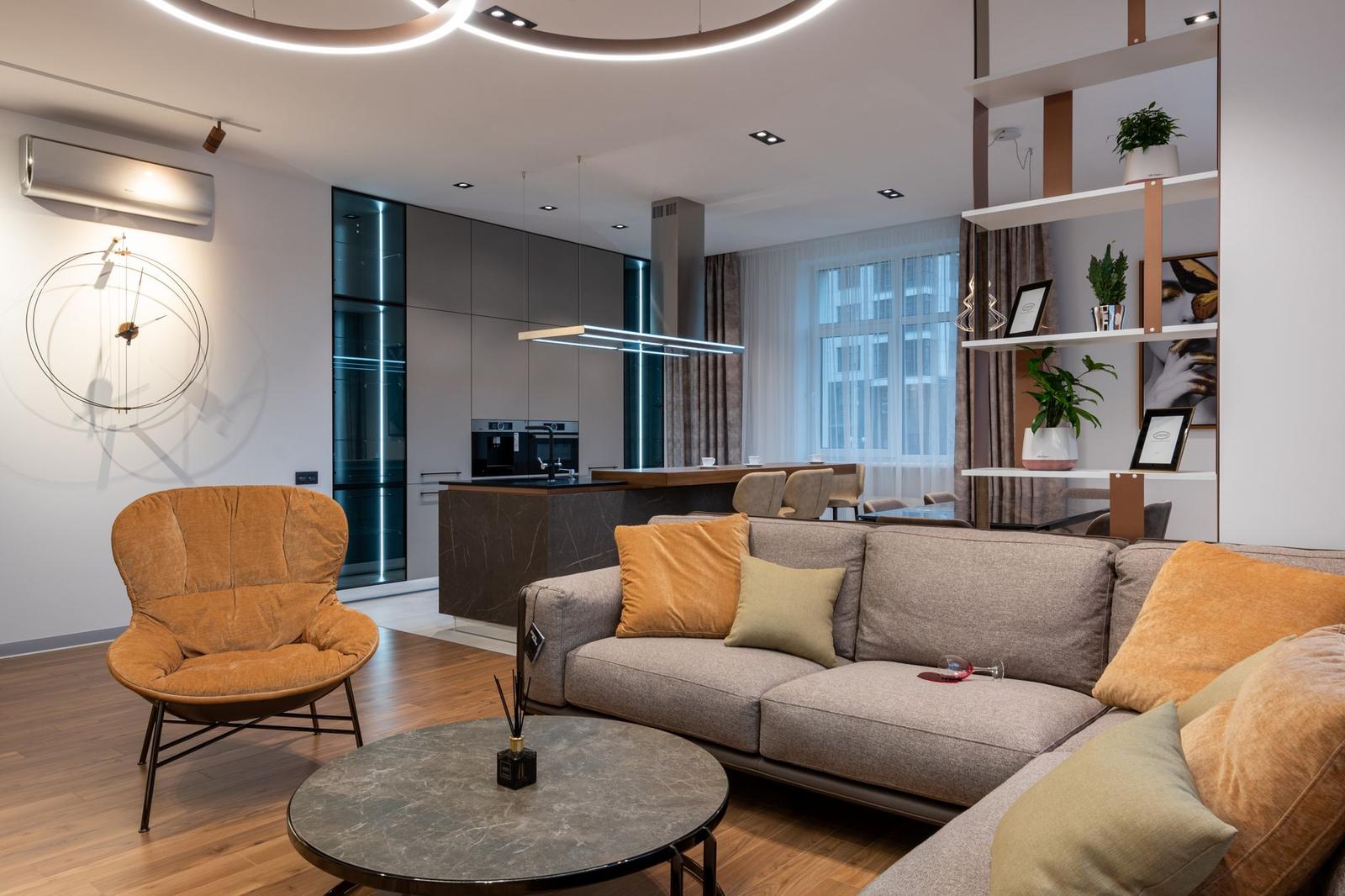
Living rooms suit symmetry well. DesignFiles notes that in formal areas like dining rooms, entryways and living rooms, symmetrical layouts often work best.
Kathy Kuo of Kathy Kuo Home, quoted by Homes & Gardens, points to matching sofas facing each other and sconces flanking a statement mirror above the fireplace. Our full guide to living room decor ideas goes deeper on layouts and layering.
Bedroom
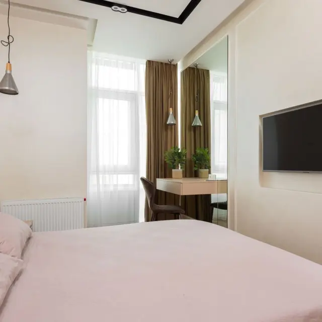
Bedrooms are a natural fit for matching pairs. Yanko Design says symmetry in a bedroom is attained with matching bedside tables and lamps, though it also cautions that too much symmetry in modern design can create a lack of visual interest.
A bold headboard is a clear emphasis piece, as DesignFiles points out. In a compact room, scale matters: DesignFiles says oversized furniture in a small room feels cramped, so read up on how to decorate a small bedroom before you buy.
Entryway
An entryway is where you set the tone, and it is one of the formal spaces where symmetry tends to work, according to DesignFiles. Keep the look tidy with a matched pair of lamps or art on either side of a console, then add one personal touch. For more, see these entryway decor ideas.
Kitchen and dining room
Kitchens are about function first, which is why DesignFiles lists task lighting for cooking, such as under-cabinet lights, as one layer of a good lighting scheme. In dining rooms, Homes & Gardens points to radial balance, with a circular table and chairs around it.
Bathroom
Small rooms like bathrooms benefit from harmony. DesignFiles shows a bathroom that achieves harmony through flooring, wallpaper and accessories in similar tones. Repeat that idea with towels, a mat and a mirror frame in the same color family.
How do lighting, scale and empty space finish a room?
Lighting is easy to overlook and hard to fix later. DesignFiles says a single ceiling fixture is not enough and lists three layers for a lighting scheme:
- Ambient: your main light source, such as ceiling lights or chandeliers.
- Task: for activities like reading, cooking or working, such as desk lamps or under-cabinet lights.
- Accent: to highlight artwork or architectural features, such as wall sconces or picture lights.
Scale is the next check. Yanko Design notes that a tiny rug in a spacious living room can appear disproportionate, and an oversized lamp on a small side table might seem overwhelming. Measure before you buy, and compare each piece with the furniture and the room around it.
For styling surfaces, DesignFiles says designers often use groupings of 3, 5, or 7, and suggests varying the height, shape and texture of the grouped items. Candles or vases on a tray are an easy place to try it.
Finally, leave some negative space. DesignFiles says it is not wasted space: it helps the eye rest and the room feel open, so avoid overfilling every wall or surface.
If a decor idea grows into a bigger job, browse these home improvement projects before you commit. Once the layout and lighting work, learn how to make your home cozy for the softer finishing touches.
Frequently asked questions
What are the basic principles of interior design?
Show answer
Balance, rhythm, emphasis, proportion and scale, and harmony form the five-principle framework in the December 2025 guide from Homes & Gardens. Other guides extend the list with ideas such as contrast and detail.
What is the 60-30-10 rule?
Show answer
Think of it as a simple split for a color scheme: a main color for most of the room, a supporting color for less, and a small pop of accent. In DesignFiles‘ version the shares are 60%, 30% and 10%, and it works best as a starting point rather than a strict requirement.
How many focal points should a room have?
Show answer
Plan on one. The DesignFiles rules post says a single strong feature keeps a room from looking cluttered, and its principles post says extra competing ones should only appear on purpose.
Do I have to follow design rules strictly?
Show answer
No. Treat the principles as a foundation, and once that is in place you can layer on personality, texture and a bit of rebellion, as designer Sean Symington puts it in Homes & Gardens.